The large, small, and dynamic viewport units are new CSS units that account for mobile viewports with dynamic toolbars. The units landed in browsers with these additional units = 1% of the size of the viewport’s inline axis. They ship in Chrome 108, joining Safari and Firefox which already have support.
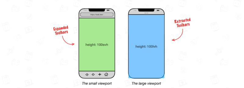
Table of contents
The viewport and its units #The need for new viewport units #Caveats #Additional resources #1 Comment
Sort: