Dashboards are a great way to share data in a visual format. Tableau, Cognos Analytics, and Python are a few tools used to create dashboards. Below you’ll find a few DO’s and DON’Ts of dashboard design.
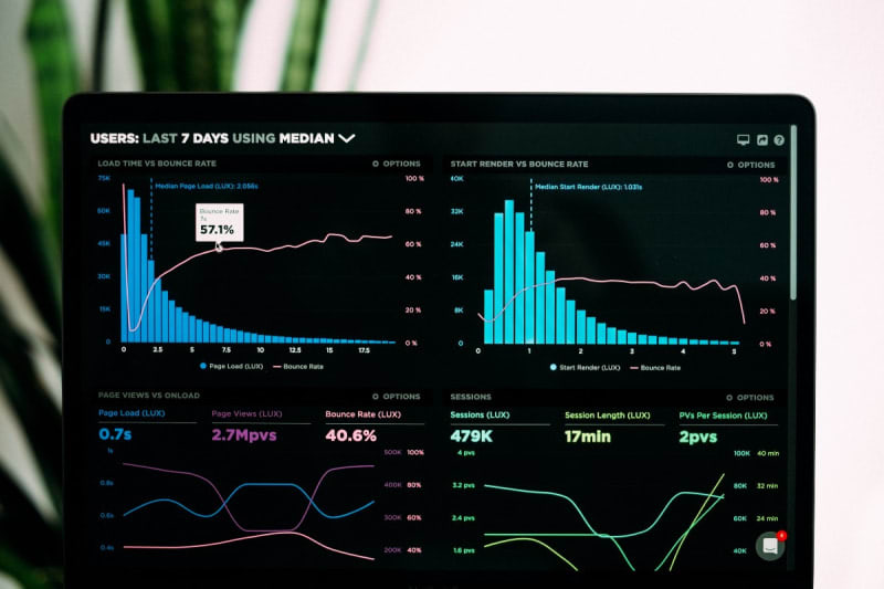
Table of contents
The Dos and Don’ts of Dashboard DesignDO: Add TextDON’T: Leave Default Font SettingsDO: Add FiltersDON’T: Randomly Place Visualizations on the PageDO: Include KPIsDON’T: Use Only One Visualization TypeDO: Use a Consistent Color SchemeDON’T: Feel Pressured to Stick With the First DesignSort: