Mobile-first is the more traditional way of making a responsive design. The way we do this, is by writing media queries that test for max-width. In mobile-first, we start by writing CSS code for smaller screens in order to optimize for mobile, and then, move up to larger screens using media queries.
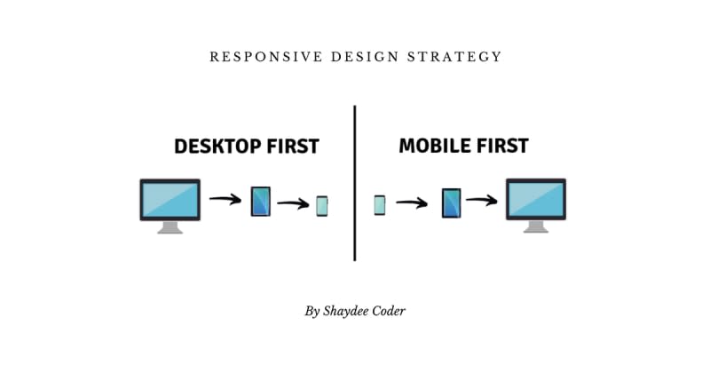
Table of contents
Desktop-first Vs Mobile-first1 Comment
Sort: