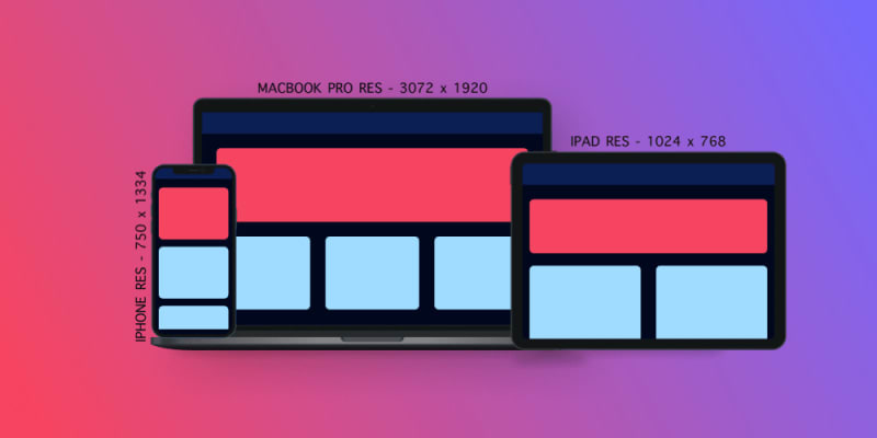
Using em/percentage/rem instead of px, so that the text, images size adjust with respect to the device width. Flex-wrap - Using flexbox to align your HTML elements such as <div> etc. Media query - Media query should be used to set width and height according to the breakpoints.
12 Comments
Sort: