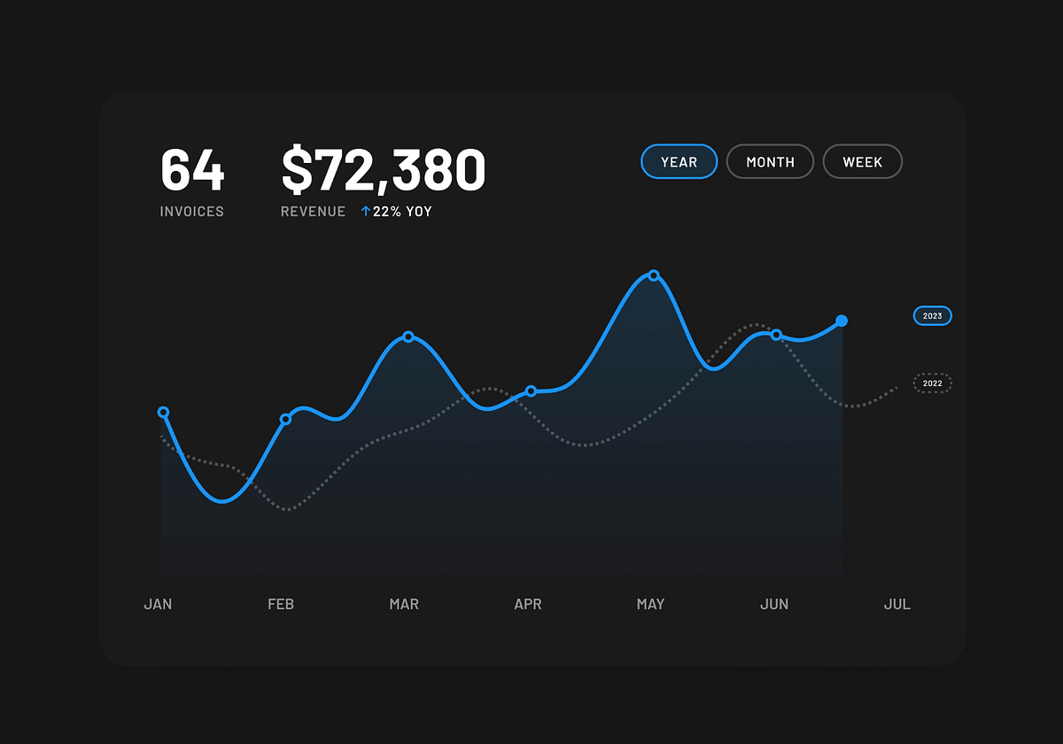
Line charts are ideal for illustrating changes over time, comparisons, and trends. To create effective line charts, limit the number of data lines to avoid clutter. Use a neutral background and a minimal, distinct color palette to enhance readability. Employ shapes and textures alongside colors for better data communication and ensure the design meets WCAG AA contrast requirements. Provide enough space for labels and incorporate interactive elements like hover states and tooltips to enrich user experience.
Sort: