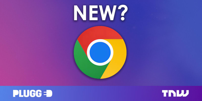
Google Chrome has a new logo, which was recently rolled out with the latest developer builds of the browser. The icon has been simplified/flattened by removing the shadows. The colors are brighter, making that fancy screen of yours pop. There’s a slight gradient on the colors because “placing certain shades of green and red next to each other created an unpleasant color vibration”
1 Comment
Sort: